
Multi-Step & Conversational Forms
Split a longer form into named steps from the visual builder. Visitors complete one step at a time, with validation before moving forward. You do not need to write a schema to create a multi-step form.
Start with a template
Open Core Forms > Add New, set Form layout to Multi-step, and choose a sample for your use case. The Multi-step badge identifies templates with named steps. Click Preview to try the sample, then Use this template to create your form.
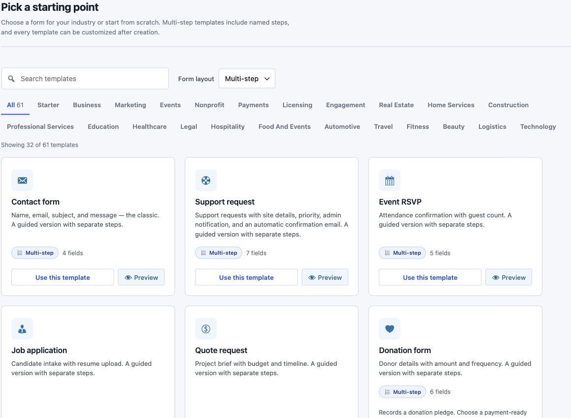
Review the form's Actions, Messages, and Settings before publishing. Templates provide starting configurations; connect any external services and check notification recipients for your own site.
Set up steps in the visual builder
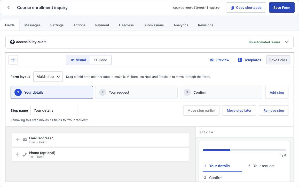
- Open the form's Fields tab. In Visual mode, choose Multi-step under Form layout.
- Enter a Step name and add the fields for that step.
- Click Add step, name the new step, and add its fields. Select a step tab to view its canvas.
- Drag a field or container onto another step tab to move it there. You can also select a field and use Move to step in its inspector.
- Use Move step earlier or Move step later to change the order.
- Save your changes. Open Preview to test the flow. With unsaved field edits, the control becomes Save & preview and saves before opening.
Move or remove steps safely
- Moving a container moves its children together. A child can also be moved out into another step.
- Submit fields belong to the final step; dragging one onto an earlier step is rejected.
- Remove step keeps its fields and moves them to the adjacent step named in the editor.
- Switching to Single page retains the step assignments so you can switch back.
- Changing a step label does not change its ID.
- Save fields and Save Form preserve the layout through Visual and Code edits.
Test the visitor experience
Use Desktop and Mobile in the preview to check labels, fields, and step navigation. A saved-form preview is a working form: submitting it runs the configured actions. A template sample preview blocks submission.
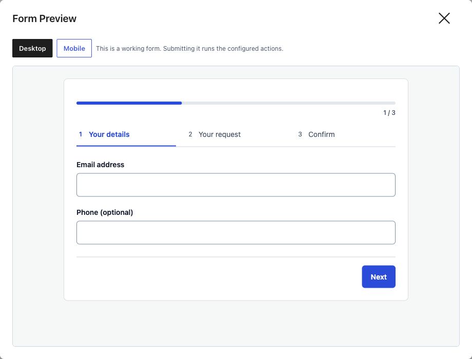
- Next validates the current step before advancing. Required fields and invalid optional values must be corrected first.
- Previous returns to the earlier step without clearing its values.
- Completed step buttons let visitors go back. Future steps are disabled until reached.
- Enter advances from a text input. A textarea keeps Enter for writing a new line.
- The final step shows the submit control. Core Forms adds one if the schema has no submit field.
Multi-step navigation has its own scoped styles. It does not depend on the optional form theme to arrange step buttons or panels. The isolated preview excludes WordPress theme assets; also check the page where you embed the finished form.
Developer setup with a schema
The visual builder stores a layout.steps array. A top-level field's group matches a step ID; children follow their container. Use label for the step's display name.
{
  "layout": {
    "type": "multi-step",
    "steps": [
      { "id": "contact", "label": "Your details" },
      { "id": "request", "label": "Your request" }
    ]
  },
  "fields": [
    { "id": "email", "name": "EMAIL", "type": "email", "label": "Email address", "required": true, "group": "contact" },
    { "id": "message", "name": "MESSAGE", "type": "textarea", "label": "How can we help?", "required": true, "group": "request" }
  ]
}
Styling reference
| Selector | Purpose |
|---|---|
.cf-progress |
Progress indicator container |
.cf-progress__bar |
Progress fill |
.cf-progress__text |
Current step and total |
.cf-steps |
Step button group |
.cf-step |
A step button |
.cf-step.is-active |
Current step, also marked aria-current="step" |
.cf-step.is-completed |
An earlier completed step |
.cf-step-panel |
Fields for a step |
.cf-step-nav |
Navigation within a panel |
.cf-step-prev |
Previous button |
.cf-step-next |
Next button |
.cf-step-submit |
Automatically supplied final submit button |
The runtime updates panel visibility and the zero-based _cf_current_step hidden field. Avoid relying on old cf-step-active or cf-step-complete classes; the current state classes are is-active and is-completed.
Conversational forms
Conversational rendering is a separate schema layout ("type": "conversational"). The visual Form layout selector offers Single page and Multi-step; it does not currently expose a conversational option. For a setup entirely through the editor, use named multi-step groups. See Fullscreen Forms for the separate fullscreen extension.