
Visual Builder
The Core Forms visual builder is a React-based interface for creating and editing forms without writing HTML. It uses a 3-column layout with drag-and-drop powered by @dnd-kit.
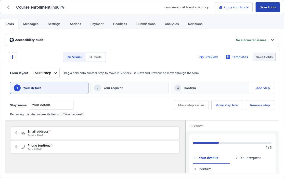
Layout Overview
The builder occupies the full post editor area and is organized into three columns:
| Column | Width | Purpose |
|---|---|---|
| Left sidebar | 280px | Field inserter panel (toggle visibility) |
| Center canvas | Flexible | Live form canvas showing all fields |
| Right sidebar | 320px | Inspector panel or inline preview |
The left sidebar slides in and out when toggled. When hidden, the canvas expands to fill the available space. The right sidebar always displays either the inspector (when a field is selected) or the inline preview (when no field is selected and the inserter is closed).
Toolbar
A horizontal toolbar sits above the three columns. From left to right:
- + (Inserter toggle) -- Opens or closes the left sidebar field inserter panel.
- Visual / Code mode switch -- Toggles between the visual drag-and-drop canvas and the raw HTML code editor. See Code Editor for details.
- Preview -- Opens a fullscreen modal showing the form as it will appear on the frontend. See Preview.
- Templates -- Opens the template picker overlay. See Templates.
- Save -- Saves the form. This writes both the JSON schema (to post meta) and the generated HTML markup (to post content) in a single operation.
Adding Fields
Click the + button in the toolbar to open the inserter panel in the left sidebar.
Search
A search input at the top of the inserter filters the field list in real time. Searching matches against field type names and descriptions.
Categorized Grid
Fields are displayed in a categorized grid layout. Each category is a collapsible section with field type icons arranged in a responsive grid.
Basic - Text, Email, Textarea, Number, Phone, URL
Choice - Dropdown (select), Radio, Checkbox
Advanced - Date, Time, File Upload, Hidden, Password
Composite - Name, Address, Consent, Rating
Structure - Fieldset (groups fields with a legend), Container (generic wrapper, nestable)
Layout - Heading (H2-H5), Paragraph, Divider, Submit Button
Click any field type to append it to the end of the form on the canvas. The inspector panel opens automatically for the newly added field so you can configure it immediately.
Canvas
The center column renders a live representation of the form fields. Each field displays its label, input element, and any help text.
Selecting Fields
Click any field on the canvas to select it. The selected field shows a blue outline and the inspector panel opens in the right sidebar with that field's settings.
Reordering Fields
Drag any field by its drag handle to reorder it within the form. The @dnd-kit library provides smooth drag animations and a drop indicator line showing where the field will land.
Hover Actions
When you hover over a field on the canvas, two action buttons appear in the top-right corner of the field:
- Duplicate -- Creates an identical copy of the field and inserts it directly below.
- Delete -- Removes the field from the form. No confirmation dialog; use undo if needed.
Empty State
When the form has no fields, the canvas shows a centered message prompting you to add fields using the inserter or choose a template.
Inspector Panel
When a field is selected, the right sidebar shows the inspector with tabbed sections for configuring the field.
General Tab
- Label -- The visible label text displayed above the field.
- Name -- The HTML
nameattribute. Auto-generated from the label (lowercase, hyphens) but editable. - Placeholder -- Placeholder text shown inside the input when empty.
- Default Value -- A pre-filled value for the field.
Validation Tab
- Required -- Toggle to make the field mandatory.
- Min Length / Max Length -- Character limits for text-based fields.
- Min / Max -- Numeric range limits for number fields.
- Pattern -- A regex pattern for custom validation (rendered as the HTML
patternattribute). - Custom Error Message -- Override the default browser validation message.
Options Tab
Visible only for select, radio, and checkbox field types.
- Options list -- Add, remove, and reorder options. Each option has a label and value.
- Default selected -- Mark which option(s) are selected by default.
- Allow multiple -- For select fields, enables the
multipleattribute.
Conditions Tab
Configure conditional visibility rules for the field. See the Conditional Fields documentation for full details on data-show-if and data-hide-if attributes.
- Show/Hide toggle -- Choose whether the condition shows or hides the field.
- Field -- Select which other field triggers the condition.
- Operator -- Equals, not equals, contains, is empty, is not empty.
- Value -- The value to compare against.
Advanced Tab
- CSS Class -- One or more CSS classes added to the field wrapper element.
- Help Text -- Descriptive text displayed below the input, rendered as a
<small>element. - ID -- Custom HTML
idattribute for the input element. - Read Only -- Makes the field visible but not editable.
Saving
The Save fields button in the toolbar saves the form in two steps:
- The JSON schema (field definitions, order, settings) is saved to the
_cf_form_schemapost meta field. - The HTML markup is generated from the schema and saved to the
post_contentfield.
Both are saved together in a single request. This ensures the schema and markup always stay in sync. The generated HTML follows the same conventions as hand-written Core Forms markup -- fields wrapped in <p> tags with <label> elements and standard HTML inputs.
If the save fails, an error notice appears below the toolbar. The form data is preserved in the editor state so nothing is lost.
Keyboard Shortcuts
| Shortcut | Action |
|---|---|
Delete / Backspace |
Delete the selected field |
Ctrl/Cmd + D |
Duplicate the selected field |
Ctrl/Cmd + S |
Save the form |
Escape |
Deselect the current field |
Tab |
Move focus to the next field |
Shift + Tab |
Move focus to the previous field |
Arrow Up / Down |
Move the selected field up or down |
Accessibility
The visual builder supports keyboard navigation throughout. The inserter grid, canvas fields, and inspector controls are all reachable via Tab. Drag-and-drop operations can also be performed with keyboard using the @dnd-kit keyboard sensor -- press Space to pick up a field, Arrow keys to move it, and Space again to drop it.
Screen reader announcements are provided for drag start, drag over, and drag end events.
Multi-step layouts
Choose Multi-step under Form layout to split fields across named steps. Select a tab to edit that step, use Add step to extend the flow, and drag fields or containers onto another step tab to move them. The inspector also provides Move to step for top-level fields. Submit controls stay in the final step.
Use Step name, Move step earlier, and Move step later to adjust the flow. Removing a step keeps its fields in the adjacent step named by the editor. See Multi-Step Forms for the complete setup and validation behavior.