
Form Design Best Practices for a Business Website: 12 Rules and Why Each One Holds
Form design best practices for a business website: 12 rules on fields, labels, layout, errors, buttons and what happens after submit, each with the reason it holds and the exception where it does not.

Form design best practices are mostly about respect: for the visitor’s time, for their attention and for the fact that they are typing into a stranger’s website. So, if you are looking for form design best practices for a business website, a contact form, a quote form, a signup or a checkout, that hold up on a phone and in front of a real customer, this guide can surely help.
I build form software, and the same 12 mistakes come up in almost every form I am asked to look at.
One guide cannot design your form for you, and a 40-field insurance application has constraints a contact form does not. This one covers the 12 rules that apply to every business form, each with the reason it holds and the exception where it does not, plus a quick audit you can run on a form you already have.
There is nothing to download. Or, if you want a second opinion on a form that underperforms, I am always available for a chat. Without further ado, let’s get started.
The Five That Matter Most
If you only fix 5 things, fix these, because they are the ones that cost the most submissions.
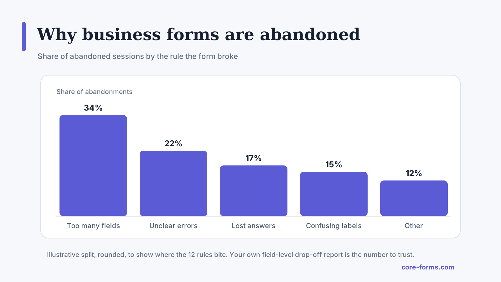 An illustrative split. The first 4 bars are rules 1, 4, 12 and 3 on this page.
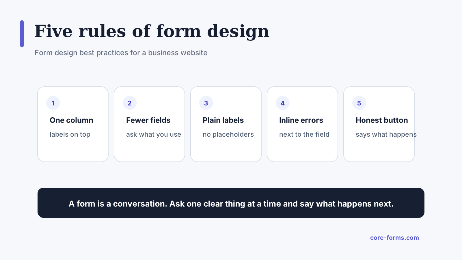 The 5 that account for most abandoned forms.
1. Ask Only What You Will Use
Every field costs submissions, and the cost compounds. The test for each one: will a person act on this answer this week? A phone number nobody calls, a company name nobody looks up and a “how did you hear about us” nobody reads are fields to delete or make optional.
The exception: a field that qualifies the lead, such as timing or team size, earns its place even though it costs a little, because it changes who replies. The lead qualification questions piece covers which ones.
2. One Column, Labels on Top
A single column reads top to bottom, works on a phone without any layout change, and never leaves the visitor guessing which label belongs to which box. Labels above the field, not beside it and not inside it.
The exception: 2 short related fields on one row, first and last name or city and postcode, when the row reads as one thing. Three on a row is a spreadsheet.
3. Labels, Not Placeholders
A placeholder disappears the moment someone starts typing, and a visitor who tabs back to check what a field wanted finds a box with their own text in it and no label. Placeholders are for format hints, “https://,” “+44,” and nothing else.
The exception: none that I have found. Even a search box is better with a visible label for screen readers, and the accessible form design piece explains why.
4. Errors Next to the Field, in Plain Words
An error at the top of the form that says “Please correct the errors below” sends the visitor hunting. An error under the field that says “Enter an email address, like name@example.com” fixes itself. Show it when the field loses focus, not on every keystroke, and keep the visitor’s other answers.
The exception: one summary at the top as well, for forms longer than a screen, so a visitor who submitted from the bottom knows something above needs attention. The validation messages piece has the wording.
5. A Button That Says What Happens
“Submit” says nothing. “Send message,” “Request a quote,” “Book the call” and “Subscribe” each tell the visitor what they are agreeing to, and the button is the last thing they read before deciding. Match it to the promise on the page.
The exception: a multi-step form’s Next buttons, which are fine as “Next” because the last step carries the real one.
The Seven That Separate Good From Fine
6. Mark the Optional, Not the Required
If most fields are required, the asterisks are noise. Mark the few optional ones with “(optional)” in the label and leave the rest plain. If most fields are optional, do the reverse. The visitor should never have to work out which convention you used.
7. Group and Name the Sections
A form over 7 or 8 fields needs headings: “About you,” “About the project,” “How to reach you.” Headings let the visitor size up the form in 2 seconds and know where they are. Over 12 fields, the headings become steps, and the multi-step form guide covers when that helps and when it only adds clicks.
8. Match the Input to the Answer
A select for 4 to 8 fixed options, radio buttons for 2 to 4 you want visible at once, checkboxes only when more than one answer is valid, a date picker for a date, a number field for a number, and a plain text field for everything with more than 8 possible answers. A select with 50 countries is fine. A select with 3 options is 2 clicks where radios are 1. The radio versus checkbox piece settles the common confusion.
9. Respect the Keyboard
Every field reachable with Tab in the order it appears on the page, Enter submits from a text field, the right keyboard on a phone for each field type: numeric for a number, email for an email, tel for a phone. The last one is an attribute on the field and it is the single easiest mobile improvement there is.
10. Say What Happens Next, Twice
Once above the button, “we reply within one working day,” and once after submit, in the success message. The visitor’s only question after clicking is “did that work and when will I hear?” and both places should answer it. The confirmation message examples cover the second one.
11. Keep the Form Where the Page Sent Them
A form that opens a new page, a popup or a third-party domain loses people at the transition. Put the form on the page, in the flow of the content that made them want to fill it in, and keep the design consistent with the page around it. A form that looks like a different website is trusted like one.
12. Protect the Visitor’s Work
Validation that clears the form on error, a session that expires mid-way, a back button that loses everything: each one is a form someone will not fill in twice. Keep the answers on error, and on a long form, offer save and resume so a visitor who has to find a document can come back.
The Limits
These are rules for business forms a stranger fills in once. An internal tool used all day by the same people has different priorities, and density beats whitespace there.
The rules do not tell you which fields to ask. That comes from what the business does with the answers, and the lead-generation forms piece covers that decision.
None of this is measured on your form until you measure it. Field-level drop-off tells you which rule your form breaks, and the drop-off diagnosis shows how to read it.
Every rule has a form it does not fit. Break one on purpose, with a reason, and watch the numbers.
What Quietly Ruins a Business Form
Fields added because someone might want the answer. Nobody does, and each one costs submissions.
A design that matches a template instead of the page. Two-column layouts, floating labels and custom dropdowns all look modern and all lose people on a phone.
An error the visitor has to hunt for, on a form that cleared their answers to show it.
A “Submit” button under a form that promised a quote.
Final Remarks
You now have 12 rules for a business form, the 5 that cost the most submissions and the 7 that separate a good form from a fine one, with the reason behind each and the exception where it does not hold. If you keep one idea from this guide, keep this one: a form is a conversation, so ask one clear thing at a time and say what happens next.
When someone asks me where to start on a form that underperforms, I tell them 2 things. Delete every field nobody acts on, this week, and watch the submission count. Then put the labels above the fields and the errors under them, because that pair fixes more abandonment than any redesign.
The contact form examples show the rules applied to real forms, and the accessible form design piece covers the part of this that is a legal requirement in many places. If you would rather talk it through for a specific form, I am always available for a chat.
I hope the next form you build is one people finish.
Once the structure is right, the form CSS guide covers styling inputs without breaking focus states and contrast.
Rule 1 has a longer argument in the short form versus long form piece.
FAQ
How many fields should a business contact form have?
Three to 5 for a contact form: name, email, message and at most 2 qualifying questions. A quote or request form can carry 7 or 8. Over that, group the fields into named steps.
Should form labels be above or beside the fields?
Above. Labels above the field read in one pass, survive on a phone without a layout change and never separate from their field. Beside works only on wide screens and breaks on narrow ones.
Is a multi-step form better than a single page?
For 8 fields or fewer, no, the extra clicks cost more than they save. For longer forms with natural groups, yes, with a progress bar and the contact details on the first step.