
Form styling
WordPress Form CSS: Style Inputs Without Breaking Accessibility
Write WordPress form CSS that preserves labels, focus rings, error states, autofill, mobile controls, dark mode, and browser-native behavior.

WordPress form CSS should make the form feel native to the site without hiding the behavior people use to complete it. The fastest way to create a polished but unusable form is to remove focus outlines, replace labels with placeholders, and force every control into the same visual shape.
Start with semantic HTML, override a small set of design tokens, and test real states: focus, error, disabled, autofill, long text, dark mode, and mobile keyboards.
The WordPress form CSS priority order
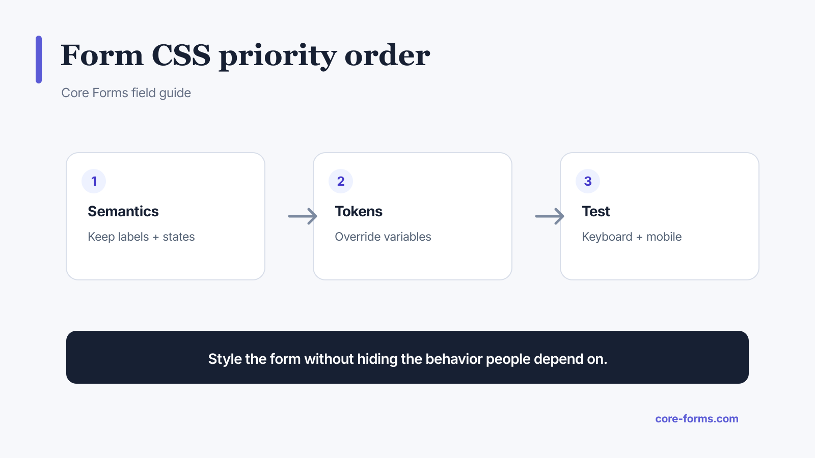 Preserve form behavior first, then apply the brand layer.
Use this order:
- Correct labels, fieldsets, buttons, and input types.
- A narrow form container and readable vertical rhythm.
- CSS custom properties for colors, radius, spacing, and focus.
- Explicit focus, validation, success, disabled, and loading states.
- Mobile and keyboard testing.
Core Forms ships a classless-first theme scoped to .cf-form, so standard HTML controls receive consistent styling. The available variables and selectors are in the CSS theming documentation.
Override tokens before selectors
Start with custom properties:
.cf-form {
  --cf-font: Inter, system-ui, sans-serif;
  --cf-text: #172033;
  --cf-bg: #ffffff;
  --cf-border: #98a2b3;
  --cf-focus: #4338ca;
  --cf-focus-shadow: rgba(67, 56, 202, 0.25);
  --cf-error: #b42318;
  --cf-success: #067647;
  --cf-radius: 8px;
  --cf-spacing: 22px;
  --cf-input-padding: 11px 13px;
}
Tokens keep focus, button, and validation colors consistent. Deep selector overrides are harder to maintain and can accidentally miss date, file, radio, or checkbox controls.
Keep a visible focus indicator
Never remove outlines without adding an equally visible replacement.
.cf-form :is(input, select, textarea, button):focus-visible {
  outline: 3px solid var(--cf-focus-shadow);
  outline-offset: 2px;
  border-color: var(--cf-focus);
}
Test focus against the actual background and in error states. A red invalid border must not erase the keyboard focus ring. The accessible form design guide covers labels, instructions, and recovery beyond CSS.
Style states, not just idle fields
Your stylesheet needs visible treatment for:
- hover where it adds information;
- keyboard focus;
- invalid field and error text;
- valid or completed state only when useful;
- disabled controls;
- read-only controls;
- submit loading state;
- success and failure messages;
- browser autofill.
.cf-form .cf-invalid {
  border-color: var(--cf-error);
}

.cf-form .cf-field-error {
  color: var(--cf-error);
  font-size: 0.875rem;
  margin-top: 0.35rem;
}

.cf-form button[disabled] {
  cursor: not-allowed;
  opacity: 0.65;
}
Do not communicate an error with color alone. Keep the specific validation message beside the control.
Respect native controls
Text inputs are straightforward. Date pickers, file inputs, selects, ranges, checkboxes, and color controls have browser and operating-system behavior that is harder to normalize. MDN’s form styling guide separates controls that are easy and difficult to style for this reason.
Avoid aggressive appearance: none unless you rebuild every necessary state and interaction. Native controls often provide:
- platform keyboard and picker behavior;
- high-contrast support;
- expected hit areas;
- forced-colors compatibility;
- familiar selected and disabled states.
Brand consistency is not worth breaking the control.
Make mobile fields comfortable
Use the correct HTML input type and autocomplete value before adding CSS. They affect mobile keyboards and autofill more than appearance does.
Check:
- controls have a practical touch target;
- text is at least 16px when iOS zoom would be disruptive;
- the form fits at 320px without horizontal scrolling;
- buttons become full width only when it helps;
- long error messages wrap;
- radio and checkbox labels remain tappable;
- sticky site elements do not cover focused fields.
Core Forms reduces spacing and makes submit buttons full width below 480px by default. Override that behavior only after testing the target layout.
Add dark mode with variables
@media (prefers-color-scheme: dark) {
  .cf-form {
    --cf-text: #f2f4f7;
    --cf-bg: #182230;
    --cf-border: #667085;
    --cf-focus: #a4bcfd;
    --cf-focus-shadow: rgba(164, 188, 253, 0.3);
    --cf-error: #fda29b;
    --cf-success: #75e0a7;
  }
}
Check contrast in every state. A dark input background with browser autofill can produce unreadable text unless autofill is tested separately.
Test with real content and tools
Test the form with:
- keyboard-only navigation;
- 200 percent zoom;
- a screen reader;
- Windows high-contrast or forced-colors mode;
- iOS Safari and Android Chrome;
- browser autofill;
- password managers;
- long names and translated labels;
- validation and server errors;
- slow submission and double-click attempts.
CSS is finished when the form remains understandable through the whole task, not when the empty state matches the mockup.
FAQ
How do I style one Core Forms form?
Target its form ID, such as #cf-form-42, and override the Core Forms custom properties there.
Can I disable the default Core Forms CSS?
Yes. Disable it per form or through the documented settings filter when your theme owns every state.
Should I remove the focus outline?
No. Replace it only with a clearly visible, accessible focus indicator.
Why are date and file inputs hard to style?
They contain browser-native and operating-system UI that varies across platforms.
What is the safest way to add dark mode?
Override semantic color variables, then test focus, errors, autofill, disabled fields, and success messages for contrast.