Accessibility
Accessible Form Design: Labels, Errors, Focus, and Autocomplete
Build accessible forms with visible labels, fieldsets, instructions, keyboard focus, specific errors, autocomplete, and reliable success feedback.

Accessible form design is not a collection of ARIA patches added after the visual design. It starts with ordinary HTML: visible labels, native controls, logical groups, useful instructions, a sensible tab order, specific errors, and a success state people can perceive.
The practical standard is simple: a person should be able to understand what a field wants, reach it with a keyboard, enter the answer, notice a problem, fix it, and know whether submission succeeded.
Accessible form design is a feedback loop
Accessibility covers the full interaction, not just the resting markup. Design what happens before input, during input, after a validation error, and after a successful submission.
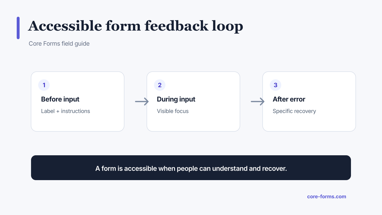 The form must explain, accept, validate, and help the person recover.
The W3C Forms Tutorial organizes the work around labeling, grouping, instructions, validation, notifications, and multi-page progress. That sequence is more useful than chasing an accessibility score.
Give every control a visible label
Use a <label> element and match its for value to the control’s id.
<label for="account-email">Account email</label>
<input id="account-email" name="EMAIL" type="email" autocomplete="email">
This does three jobs:
- gives the control a programmatic name;
- lets speech-input users target it by label;
- enlarges the clickable area because clicking the label focuses the input.
Placeholder text is not a label. It disappears during entry, often has weak contrast, and cannot reliably explain the field after a value exists.
Use fieldset and legend for related choices
Radio buttons and related checkboxes need a group question plus an individual label for every option.
<fieldset>
  <legend>How should we reply?</legend>
  <label><input name="REPLY_METHOD" type="radio" value="email"> Email</label>
  <label><input name="REPLY_METHOD" type="radio" value="phone"> Phone</label>
</fieldset>
Without the legend, a screen reader may announce “Email, radio button” without the question it answers.
Put instructions before they are needed
Explain formats, limits, and consequences before the control, not only after an error.
Good instructions include:
- date format when the control does not make it obvious;
- allowed file types and maximum size;
- whether a phone number will be used for calls or text messages;
- password rules before entry;
- why sensitive information is requested;
- how optional data changes the result.
Keep general instructions near the form heading and field-specific help next to the field. Connect longer help with aria-describedby.
<label for="evidence">Screenshot or text log</label>
<p id="evidence-help">PNG, JPG, or TXT up to 5 MB. Do not include passwords or API keys.</p>
<input id="evidence" name="EVIDENCE" type="file"
       accept="image/png,image/jpeg,text/plain"
       aria-describedby="evidence-help">
Use the correct input type and autocomplete token
Types such as email, url, tel, number, and date give browsers useful semantics and input behavior. Autocomplete tokens tell the browser what personal detail the field represents.
Common tokens include:
name;given-nameandfamily-name;email;tel;organization;street-address;postal-code;country-name;current-passwordandnew-password.
Do not use autocomplete="off" as a reflex. Autofill can reduce typing and cognitive load, especially on mobile.
Keep keyboard focus visible
Every control, button, link, and custom interactive element must be reachable in a logical order. The focused element needs a visible indicator with enough contrast against its surroundings.
Do not remove outlines without replacing them:
:focus-visible {
  outline: 3px solid #4f46e5;
  outline-offset: 3px;
}
Test with the keyboard:
- Reload the page.
- Put the mouse aside.
- Press Tab through the form.
- Use Space for checkboxes and buttons.
- Use arrow keys within radio groups and selects.
- Submit invalid data.
- Confirm focus moves to useful error feedback.
- Correct the fields and submit successfully.
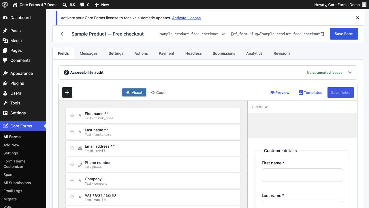 Native fields and inspectable markup make keyboard and label checks easier to perform.
Write errors that help someone recover
“Invalid input” is a status, not an instruction. A useful error names the field and describes the correction.
Weak:
- “Invalid.”
- “Required.”
- “Something went wrong.”
Useful:
- “Email: enter an address in the format name@example.com.”
- “Resume: upload a PDF or DOCX file smaller than 5 MB.”
- “Event date: choose a date on or after July 23, 2026.”
After a failed submit:
- show an error summary before the form;
- make each summary item link to the corresponding field;
- show the same message next to the field;
- mark the invalid field with
aria-invalid="true"; - connect the message with
aria-describedby; - preserve valid answers;
- move focus to the summary or first error.
Color can support the message, but it cannot be the only signal.
Announce success and failure
A successful submission should produce a clear status that keyboard and screen-reader users can perceive. It should also state what happens next.
Example:
Your application was received. We sent a copy to the email you entered. The hiring team will review it by July 31.
For AJAX forms, use an appropriate live region or focus target for the updated message. Do not leave focus on a disabled submit button while the new content appears somewhere else.
Required fields need more than an asterisk
State the convention before the form, for example “Required fields are marked ‘Required’.” Then include the required attribute and visible field text.
<label for="full-name">Full name <span>Required</span></label>
<input id="full-name" name="NAME" type="text" required aria-required="true">
An asterisk can remain as a visual shorthand, but it needs an explanation.
Do not overbuild native controls
Native buttons, inputs, selects, textareas, fieldsets, and details elements already carry keyboard and accessibility behavior. Recreating a select with generic div elements means taking responsibility for roles, states, focus, keyboard interaction, announcements, and browser compatibility.
Use a custom control only when the native control cannot serve the task. Progressive enhancement is a safer default.
Validate in the browser and on the server
HTML constraints such as required, type="email", min, and max provide fast browser feedback. JavaScript can add cross-field rules and better messages. Neither replaces server-side validation.
The browser can be bypassed through developer tools, a direct HTTP request, or a script. Validate the same rules at the server and return errors in a structure the form can present accessibly.
Test accessible form design manually
Automated tools catch missing labels, duplicate IDs, some contrast problems, and invalid ARIA. They do not prove that instructions make sense, focus order is logical, errors are useful, or the form works with a real screen reader.
For every important form, perform:
- keyboard-only completion;
- zoom at 200% and 400%;
- narrow viewport testing;
- browser autofill testing;
- invalid submission and recovery;
- success announcement testing;
- at least one screen-reader path for complex forms;
- a content review of labels and instructions.
Core Forms includes an accessibility feature overview and starter templates with labels, groups, autocomplete, and required-state markup. A template is a head start, not a waiver from testing your changes.
FAQ
What makes a form accessible?
An accessible form has understandable labels and instructions, semantic controls, logical keyboard navigation, visible focus, specific error recovery, perceivable status messages, and sufficient contrast and reflow.
Can I use placeholder text as a label?
No. Keep a visible label. Placeholder text can provide a short example but should not carry the field’s identity or required instructions.
Is ARIA required for every form field?
No. Native HTML with correct labels often needs little ARIA. Use ARIA to express relationships or dynamic states that native markup does not already convey.
Should errors appear while someone types?
Avoid aggressive errors before the person has had a fair chance to answer. Validate on blur or submit, and clear the message promptly after the value becomes valid.
Does an automated accessibility scan prove WCAG conformance?
No. Automated checks cover only part of the requirements. Manual keyboard, content, focus, error, zoom, and assistive-technology testing are still necessary.