
Form validation
Form Validation Messages That Help People Recover
Write specific, accessible form validation messages that explain the error, preserve user input, focus the failed field, and help people recover.

Form validation messages should help a person recover, not scold them for failing a rule they could not see. “Invalid input” is technically an error message, but it does not say what is wrong, what format is accepted, or where to go next.
The best validation pattern is simple: detect the exact rule that failed, explain it beside the field, preserve every valid answer, and move focus to the first problem after submission.
What good form validation messages contain
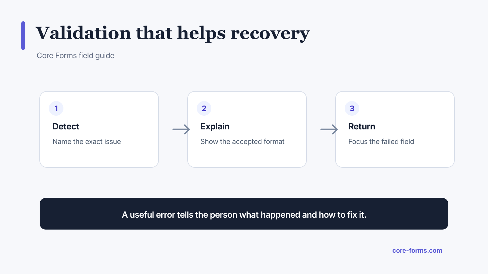 A useful error names the issue, gives a recovery instruction, and returns the person to it.
A useful message normally contains:
- the field or value that needs attention;
- the reason it was rejected;
- the accepted format or range;
- a correction the person can make immediately.
Compare these pairs:
| Weak message | Useful message |
|---|---|
| Invalid email | Enter an email address in the format name@example.com. |
| Required | Enter your company name. |
| Invalid date | Choose a date between August 1 and August 31, 2026. |
| File error | Upload a PDF or DOCX file smaller than 10 MB. |
| Wrong number | Enter a quantity from 1 to 20. |
Specificity is the difference. Do not expose implementation details such as a regex, database rule, or HTTP code.
Put the error where it can be found
Inline errors belong next to the affected control. A summary at the top can help on a long form, but it should link to the individual fields rather than replace their messages.
An accessible field error needs more than red text:
- add
aria-invalid="true"to the failed control; - connect the message with
aria-describedby; - keep the visible label intact;
- use
role="alert"when a new message must be announced; - do not rely on color alone;
- focus the first invalid field after a failed submit.
The W3C form notification tutorial recommends concise feedback, clear correction guidance, and programmatic association between errors and controls. Core Forms applies these ideas to its accessible validation system.
<label for="email">Work email</label>
<input
  id="email"
  name="email"
  type="email"
  aria-invalid="true"
  aria-describedby="email-error"
>
<span id="email-error" role="alert">
  Enter an email address in the format name@example.com.
</span>
Validate at the right time
Do not show an error while someone is still typing the first character. That creates noise and can make a correct answer look wrong.
A practical sequence is:
- Validate a field after blur when enough information exists.
- Recheck it as the person corrects the value.
- Validate all visible fields when the form is submitted.
- Skip fields hidden by conditional logic.
- Repeat validation on the server before accepting data.
Client-side validation improves speed. Server-side validation protects the workflow. The W3C validation guidance makes the same distinction: browser checks help, but the server still has to verify submitted data.
Preserve answers after an error
An error should not erase correct work. Preserve every safe value and return the form with only the failed fields marked.
Exceptions need careful handling:
- passwords may be cleared for security;
- card details should remain inside the payment provider’s secure control;
- file inputs often cannot be repopulated by the browser;
- a rejected upload should explain whether the person must choose the file again.
On a multi-step form, keep the person on the step containing the error. Do not send them to step one with no explanation.
Match the message to the rule
HTML already provides useful constraints: required, type="email", min, max, minlength, maxlength, and pattern. Write a message for each rule people can hit.
For example:
<label for="team-size">Team size</label>
<input id="team-size" name="team_size" type="number" min="1" max="500" required>
Possible messages are:
- empty: “Enter your team size.”
- below range: “Enter at least 1.”
- above range: “Enter 500 or fewer.”
- wrong type: “Enter a whole number.”
Avoid one generic message for all four failures. Also treat 0 deliberately. Zero can be a valid rating or quantity in some forms even though loose truthiness checks treat it as empty.
Test recovery, not only rejection
Validation QA should prove that a person can get from an error to success.
Test these paths:
- submit an empty form;
- enter a valid zero where allowed;
- use international names and addresses;
- paste leading or trailing spaces;
- switch a conditional field off after filling it;
- trigger errors with a keyboard and screen reader;
- correct the first error and submit again;
- lose the network after pressing submit.
Use form analytics to find repeated errors, but read them with a denominator. One hundred errors across ten thousand attempts is different from one hundred errors across two hundred attempts.
FAQ
What is a good validation error message?
It names the problem and tells the person exactly how to correct it, such as “Enter a date between August 1 and August 31, 2026.”
Should errors appear before submit?
Validate on blur when it helps, but avoid interrupting people while they are still typing. Always run full validation on submit.
Is red text enough for an error?
No. Use text, programmatic association, aria-invalid, visible focus, and placement beside the field.
Should the form clear after a validation error?
No. Preserve valid answers wherever it is safe and technically possible.
Does client-side validation secure a form?
No. It improves feedback. The server must validate and sanitize every submitted value again.