
Multi-step forms
Form Progress Bars: When They Help and When They Lie
Use form progress bars when the path is known and meaningful. Avoid misleading percentages, conditional-step errors, and decorative multi-step forms.

Form progress bars help when they answer a real question: how much work remains? They hurt when the percentage is decorative, the denominator changes silently, or “100%” appears before validation, payment, or submission has finished.
A progress bar creates an expectation. If the next screen adds surprise questions or the final button still leads to a long checkout, the interface did not merely estimate badly. It broke trust.
A form progress bar must describe reachable work
Count the steps or required work on the person’s actual path. Conditional questions mean different people can have different denominators.
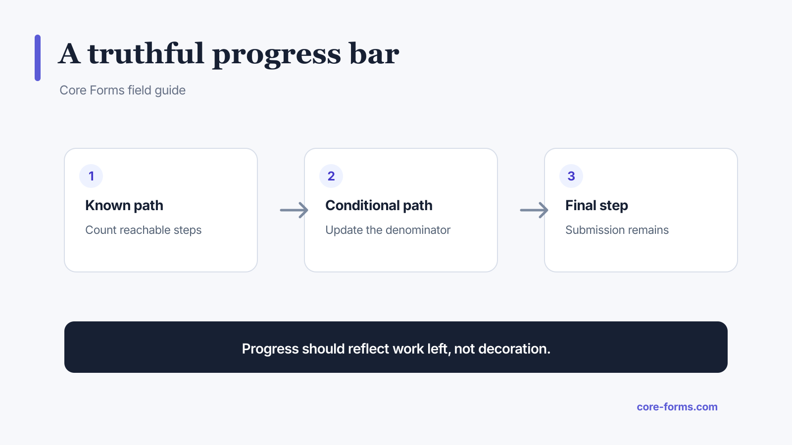 The denominator should follow the reachable path, and submission still counts as work.
Use a form progress bar when:
- the form has three or more meaningful groups;
- the path is long enough that remaining work is uncertain;
- steps have reasonably comparable effort;
- conditional branches can update progress accurately;
- users can go back without losing answers;
- the final completion event is clear.
Skip it when:
- the form has only a few fields;
- one screen is split into fake steps for visual drama;
- most work happens in one upload or essay field;
- the path cannot be estimated honestly;
- the indicator would take more attention than the form.
Step count is often better than a percentage
“Step 2 of 4” is easier to defend than “50% complete.” It names the unit. A percentage implies comparable work, which is rarely true when one step contains an email field and another contains a portfolio upload.
Use a percentage when:
- steps are stable and similar;
- the numerator and denominator are clear;
- conditional paths are recalculated;
- the value never goes backward without an understandable action.
Use a step label when:
- groups differ in effort;
- the form has a small fixed number of sections;
- a descriptive title such as “Contact,” “Project,” and “Review” is more useful than math.
Do not show 100% before submission succeeds
The final review screen is not completion. The user may still need to:
- accept terms;
- solve a validation problem;
- upload a file;
- complete hosted payment;
- wait for a network response;
- retry a failed action.
At the review screen, use “Final step” or a value below 100%. Move to 100% only after the server confirms the form’s success state.
Conditional logic changes the denominator
Imagine a five-step application where employed candidates see an extra employment-history step. If everyone starts with “1 of 5,” then one group later becomes “3 of 6.” The progress bar appears to move backward even though the person advanced.
Better approaches:
- determine the reachable path after the branching answer;
- use named sections without a percentage until the path is known;
- count only stable top-level steps and treat conditional fields within them;
- explain when an answer adds a required section.
The conditional logic feature can show the appropriate fields. The progress calculation must use the same visibility state.
Do not turn short forms into multi-step forms
One field per screen looks focused but creates more navigation, more waiting, and less context. A name, email, and message belong together on an ordinary contact form.
Multi-step structure helps when groups have meaning:
- identity and contact;
- project or application details;
- supporting files;
- review and consent.
It does not help when the grouping is “first name,” “last name,” “email,” and “submit.”
Preserve progress when something fails
A progress indicator is useless if a validation or network error erases completed answers.
The form should:
- keep valid values;
- return focus to a useful error summary;
- link the error to its field, even on an earlier step;
- retain uploaded-file state when safely possible;
- avoid clearing the current step during retry;
- support save and resume for long, interruptible work.
 Long work needs recovery and persistence, not just a percentage.
For applications and intake forms, save and resume is often more valuable than a polished progress animation.
Label the steps, not only the line
A bar with four dots gives little information. Add text:
- Contact;
- Requirements;
- Files;
- Review.
Mark the current step programmatically, such as with aria-current="step". Ensure completed, current, and upcoming states do not rely on color alone.
Do not put keyboard focus on a decorative progress bar. If completed step labels are clickable, they become navigation and need ordinary link or button behavior.
Announce progress changes carefully
When the step changes, move focus to the new step heading or announce the new heading and position through a polite live region. Avoid announcing every small percentage update.
Useful:
Step 3 of 4: Supporting files.
Noisy:
51 percent. 52 percent. 53 percent.
Measure whether the progress bar helps
Compare more than final conversion:
- start rate;
- completion rate;
- time to complete;
- step-level exits;
- validation errors;
- back-navigation use;
- save-and-resume use;
- support messages about the form.
If the multi-step version increases completion but doubles invalid or unusable submissions, it did not necessarily improve the workflow.
The form analytics feature separates starts, completions, and field drop-off so you can inspect the actual failure point.
A reliable progress calculation
For a fixed four-step form, the current-step percentage can use:
progress = completed steps ÷ total reachable steps × 100If the person is on step 2 but has completed only step 1, the progress is 25%, not 50%. This distinction prevents the bar from claiming credit for the unfinished current step.
For field-level progress, count only visible required fields when optional fields do not block completion. Explain the unit when the exact percentage matters.
FAQ
Do progress bars improve form completion?
They can reduce uncertainty on genuinely long, structured forms. They do not fix weak offers, unnecessary fields, confusing questions, or technical failures.
Should a progress bar show steps or percentage?
Use steps when sections differ in effort. Use a percentage only when the denominator is stable and the value represents comparable completed work.
Should the review screen show 100 percent?
No. Submission, validation, payment, or another final action still remains. Show 100% only after success is confirmed.
How do conditional fields affect progress?
They change the reachable work. Recalculate the denominator, count only stable top-level steps, or wait to show a precise indicator until the path is known.
Is one question per screen better?
Not automatically. It can help focused surveys, but it also increases navigation and hides context. Group related simple fields when they are easier to understand together.