
Form design
Short Form vs Long Form: Ask for What You Will Actually Use
Choose a short form or long form by commitment, decision value, and data sensitivity, not by a magic field count.

The short form vs long form argument is usually framed as conversion against lead quality. That is too crude. The real question is whether each field creates enough decision value to justify the effort, risk, and trust it asks from the person filling it out.
A three-field form can feel long when it asks for a phone number, budget, and company revenue before offering any value. A twelve-field application can feel reasonable when every answer clearly affects eligibility or delivery.
Short form vs long form depends on the job
Use a short form for low-commitment actions and an intentionally longer form for complex decisions. Do not choose length from a universal “best number of fields.”
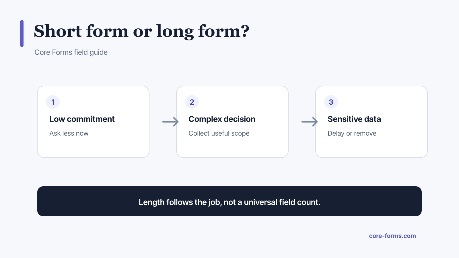 Length follows commitment, decision complexity, and data sensitivity.
Choose a short form when:
- the next step is reversible;
- the visitor has little context or trust;
- one contact detail is enough to deliver value;
- qualification can happen after a reply;
- the page serves mobile or interrupted users;
- the data is sensitive relative to the promise.
Choose a longer form when:
- the decision requires comparable evidence;
- a human review would otherwise start with the same follow-up questions;
- the person expects an application or intake process;
- the form calculates a price or eligibility result;
- legal, safety, or operational requirements justify the fields;
- saving and resuming is available for genuinely long work.
Count decisions, not fields
Fields are a poor unit because effort varies. Selecting a country is fast. Finding an account number is not. Writing a project summary is not. Uploading a file from a phone can be much harder than typing an email address.
For every field, ask:
- What decision or action uses this value?
- Who uses it?
- When do they use it?
- Could it be inferred or collected later?
- What happens if the answer is wrong or missing?
- Does the promise on the page justify the sensitivity?
If nobody can answer the first three, remove the field.
A practical field-value test
Score each proposed field on two axes:
- Decision value: how much it changes routing, eligibility, pricing, delivery, or the reply.
- User cost: time, recall, sensitivity, uncertainty, device friction, and file handling.
High-value, low-cost fields belong early. High-value, high-cost fields may belong later or behind a save-and-resume step. Low-value, high-cost fields should disappear.
This is why email often belongs on a newsletter form and phone often does not. Email delivers the newsletter. Phone adds risk without changing delivery.
Short forms are not automatically better
A form can be too short to do its job. A one-field quote request that collects only email forces a sales rep to ask what service, scope, and outcome the person needs. The visitor waits longer and the team processes noise.
Short forms fail when they:
- hide the nature of the next step;
- generate leads with no usable context;
- create several avoidable follow-up messages;
- send every request to the same person;
- move necessary work from the visitor to an expensive internal queue;
- optimize submission count instead of completed outcomes.
Use the quote request form template as an example of a form that asks enough to route the request without demanding a full brief.
Long forms are not automatically more qualified
More answers do not guarantee more truth. A visitor who does not know the budget may choose a random range to get through the form. A candidate may paste generic text into a required cover letter. A customer may choose the first option in a long required dropdown.
Long forms fail when they:
- ask questions the team never reads;
- require precise answers before the person can know them;
- repeat data already stored in an account;
- request sensitive information before trust exists;
- hide how much work remains;
- lose progress on error or timeout;
- make every conditional path equally long.
The save and resume feature is useful for applications and intake, but it should not justify unnecessary questions.
Use progressive disclosure for conditional work
Do not show tax details, guest counts, technical logs, or follow-up questions to everyone. Reveal them when an earlier answer makes them relevant.
 Conditional paths keep the default view short without deleting necessary follow-up.
Examples:
- show guest count after “Yes, I will attend”;
- show company details after “Buying for a business”;
- show an explanation box after a low satisfaction score;
- show file upload after “I can reproduce the bug”;
- show tax ID after a country or business purchase choice.
With conditional fields, the form length follows the person’s path instead of showing the union of every possible question.
Put expensive questions after earned context
The order matters as much as the count.
Start with questions that are:
- easy to understand;
- clearly relevant;
- low sensitivity;
- quick to answer;
- useful for shaping later questions.
Move files, long text, legal confirmations, and sensitive personal details later. Explain why the information is needed before asking for it.
Do not use this order to trick people into a sunk-cost submission. It is meant to build context, not hide the real burden.
Measure the path instead of guessing
Track at least:
- views;
- starts;
- successful submissions;
- validation errors;
- last field reached on incomplete sessions;
- conditional path or source when relevant.
If views are high and starts are low, the problem may be the offer, trust, or first screen. If starts are healthy and one field has concentrated drop-off, inspect that field. If submit attempts fail, inspect validation and action errors.
The form analytics feature keeps these stages separate. Do not remove three fields because a page-level conversion rate fell when the actual problem is a broken email action.
My rule for choosing form length
Use the shortest form that completes the user’s promised task and gives the recipient enough information to take the next real action.
That rule has two sides:
- “Shortest” removes data hoarding and internal curiosity.
- “Completes the task” prevents empty leads and avoidable follow-up.
The right form is not short or long in isolation. It is proportionate.
FAQ
How many fields should a lead form have?
There is no universal count. Start with the delivery or reply field, then add only the segmentation or qualification fields that change the next action.
Do shorter forms convert better?
They often reduce effort, but field sensitivity, value proposition, audience intent, and technical reliability can matter more than raw field count.
When should I use a multi-step form?
Use one when related questions form logical groups, the path is genuinely long, and a progress indicator can describe the remaining work honestly.
Should optional fields stay on the form?
Only when their answers are useful enough to justify visual and cognitive load. “Optional” does not make a field free.
How do I shorten a long form?
Remove unused fields, infer data already known, collect sensitive data later, use conditional disclosure, combine redundant questions, and separate initial qualification from onboarding.