
How to Create Full-Screen Forms in WordPress
Turn any WordPress form into a Typeform-style conversational form with one question per screen, a progress bar and its own shareable URL.

Typeform made one question per screen the look people expect from a modern survey or application, and many WordPress sites now want that same feel without sending visitors to a hosted tool. So, if you are looking to build conversational forms on your own WordPress site, with the answers stored in your own database, this guide can surely help.
I build Core Forms, and full-screen mode is one of its display settings, so any form you already have can switch over.
Full-screen is not right for every form, and one article cannot redesign yours. But turning it on, choosing a theme and publishing the form on its own URL takes the same few settings every time. In this one I will cover those, along with where the format stops working.
The form in the screenshots is the plugin’s Customer survey template running in full-screen mode. If you get stuck along the way, support is a message away. Without further ado, let’s get started.
What Full-Screen Mode Does
Full-screen mode shows a form one question at a time, the way conversational forms do, with the rest of the form hidden until the visitor moves on. It is a display setting, so the form keeps its fields, validation, email actions and submissions exactly as they were.
- Each
<p>or field wrapper in the form becomes one step. - Only one step is visible at a time.
- Visitors move forward with Enter, Tab or the on-screen buttons.
- A progress bar shows how far through the form they are.
- The final step submits through the same handler as the normal form.
The mode works in two places. Embedded with the [cf_form] shortcode, the form sits inside your theme. On a standalone page, it gets a clean screen with no theme header, footer or sidebar, which is where the full-screen look makes the most sense.
Turn On Full-Screen Mode
The switch lives in the form’s settings, not in the builder:
- Open the form in Core Forms and click the Settings tab.
- Expand Display mode.
- Set Form Display Mode to Fullscreen (Typeform-style).
- Choose a Theme: light or dark.
- Choose an Animation Style: slide, fade or none.
- Leave Show Progress Bar on unless the form has only 2 or 3 questions.
- Click Save Changes.
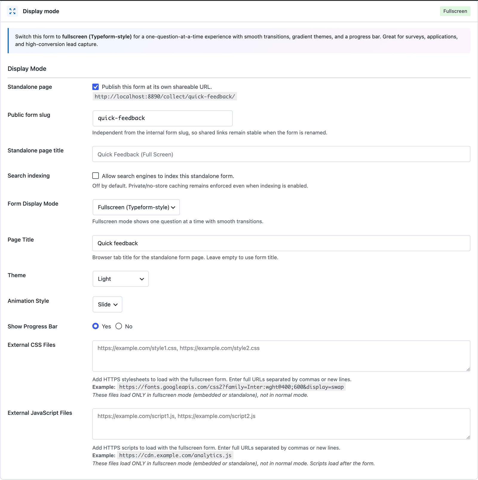 The Page Title field sets the browser tab text for the full-screen page.
Slide is the default animation, and it makes the most sense for a survey because it shows forward movement. Fade suits a calmer, longer application. None is the right choice for anyone who has reduced motion turned on, or for a form people fill in every day.
Publish It on Its Own URL
A full-screen form looks best on a page of its own, and Core Forms can publish one without you creating a WordPress page. The same Display mode section holds these settings:
- Standalone page publishes the form at a clean URL such as
/collect/quick-feedback/. - Public form slug sets the last part of that URL. It is separate from the internal form slug, so renaming the form does not break links you have already shared.
- Standalone page title sets the title of that page.
- Search indexing is off by default, so standalone pages carry
noindex, nofollowunless you turn it on.
The /collect/ part can be changed under Core Forms > Settings > Standalone URL base, for example to apply or forms. Core Forms refuses a base that clashes with an existing page or a WordPress path.
Standalone responses are always private and never cached, even when indexing is on. That keeps form security tokens, saved drafts, prefilled values and confirmation messages out of a shared page cache, where one visitor’s page could otherwise be served to the next.
What Visitors See
The first screen shows one question, a numbered badge, the answer box and an OK button with a “press Enter” hint.
 One question and one button leave nothing on the screen to compete for attention.
Choice questions turn each option into a large card with a letter badge beside it, and a Back button appears from the second question onward.
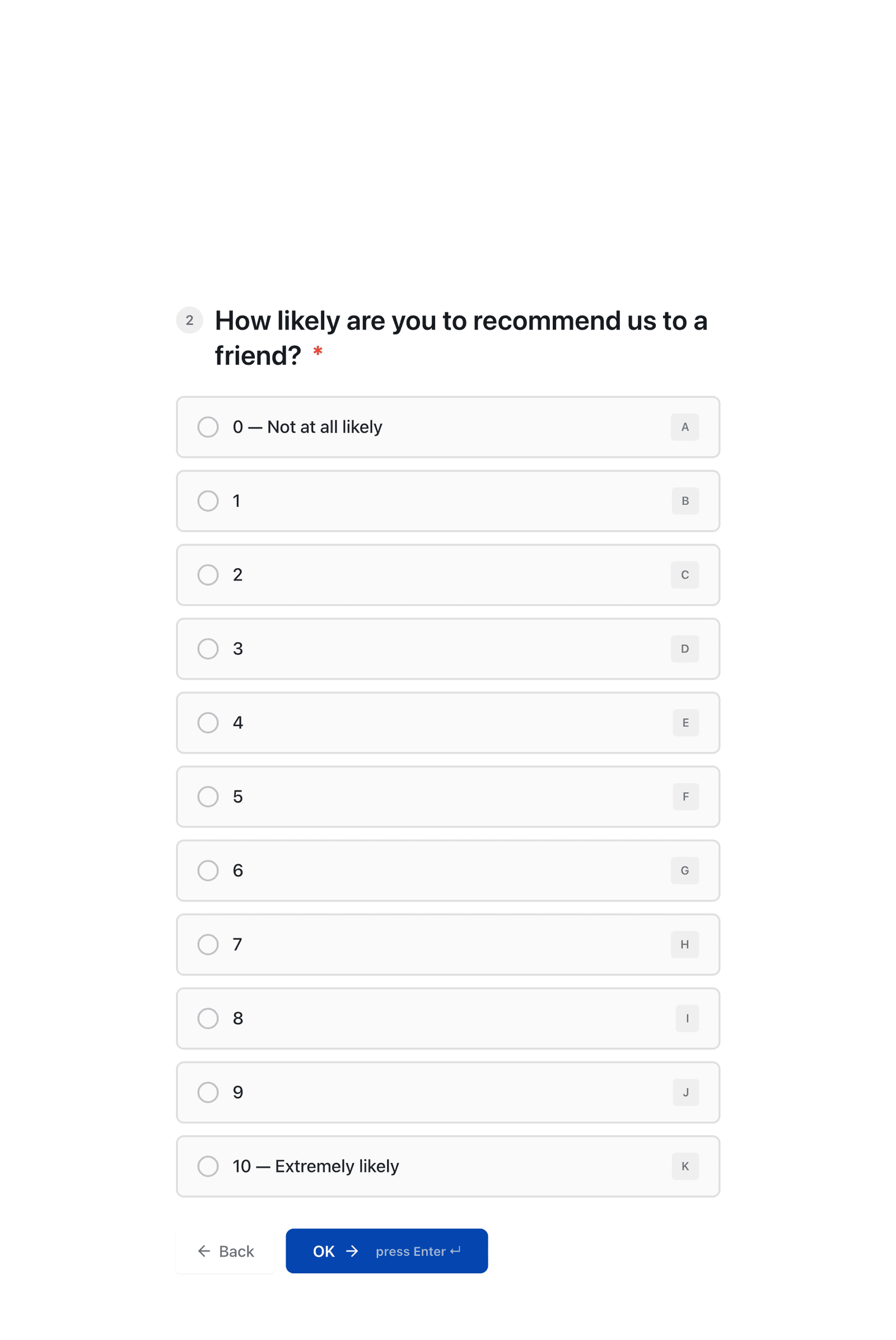 The progress indicator in the corner reads 2 of 5, so visitors always know how much is left.
On a phone, the same form fills the screen, and the OK button sits within thumb reach.
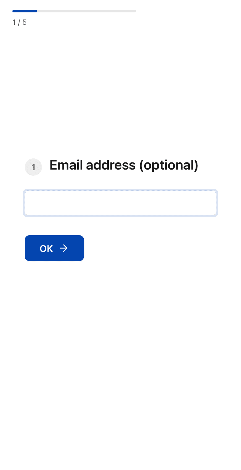 The press Enter hint drops away on small screens, where there is no keyboard to press.
Long choice lists need a second look. The 0 to 10 scale above is taller than a typical laptop window, so the question scrolls out of view while people read down the cards. A dropdown or a star rating keeps a long scale on one screen.
Style It
On the standalone page, the full-screen theme is self-contained, so it does not pick up your WordPress theme’s fonts or colors. Two settings let you bring your brand in:
- External CSS Files loads your own stylesheets after the default full-screen styles, so your rules win.
- External JavaScript Files loads scripts after the form, which suits analytics or a chat widget.
Both accept HTTPS URLs, separated by commas or new lines, and both load only in full-screen mode. For smaller changes, two hooks add code to the full-screen page’s head and footer:
add_action( 'cf_fullscreen_head', function() {
    echo '<style>.cf-fullscreen-step { max-width: 600px; }</style>';
} );

add_action( 'cf_fullscreen_footer', function() {
    echo '<script>console.log( "Full-screen form loaded" );</script>';
} );
A hook keeps a small style change in your theme or a snippets plugin instead of in a separate file. The full-screen documentation lists every setting and hook.
Full-Screen or Multi-Step
Core Forms has two ways to break a form into parts, and they solve different problems. Multi-step groups several fields into named steps, like “Your details” and “Your project.” Full-screen shows one question at a time with nothing else on the screen.
- Choose full-screen for short surveys, quizzes and lead forms of about 5 to 10 questions, where each question deserves a moment of attention.
- Choose multi-step for longer applications, where related fields such as a name, email and phone number belong together on one screen.
A 25-field job application in full-screen mode means 25 separate screens, and people notice every one of them. The form in this guide’s screenshots is the Customer survey template, and the guide to creating a survey in WordPress builds it step by step. The guide to multi-step forms and the post on form progress bars go deeper on how to split a long form.
When Typeform Is Still the Better Pick
Typeform remains the simpler choice for a team without a WordPress site, or one that wants a hosted design editor, shared workspaces and reporting built in. It is a polished product, and it does the one-question-per-screen format very well.
A WordPress site already has a place to keep the answers. With Core Forms, the full-screen form stores every response in your own database, sends the same email notifications as your other forms and uses the same integrations. There is no per-response limit from a separate service. If data ownership is the reason you are looking, the list of Google Forms alternatives for WordPress covers the same decision from another angle.
The Limits
Full-screen mode splits the form wherever the field wrappers are. Two fields inside one <p> show up together on one screen, so a form built with custom markup may need its wrappers adjusted before it looks right.
The embedded version inherits your theme’s styles. Most of the time that is fine, but a theme with heavy form styling can fight the full-screen layout, which is one more reason the standalone page is the better home.
The dark theme needs a check with your own questions before you share it. Test every question type you use, especially choice cards, and confirm the text is easy to read against the dark background.
A standalone page is hidden from search engines by default. That is right for most forms, but a form meant to be found through Google needs Search indexing turned on, along with a page title that describes it.
What Quietly Ruins a Full-Screen Form
Using it for a long form. Each question gets a screen of its own, and 20 screens feel much longer than 20 fields on one page.
Putting the hardest question first. The first screen decides whether people start at all, and a salary or budget question there loses people who would have happily answered it at step 6.
Leaving the progress bar off to hide the length. People who cannot see the end tend to assume it is further away than it is, and they leave.
Loading heavy scripts through External JavaScript Files. Every script delays the first question, and a full-screen form that shows a blank screen for two seconds looks broken.
Testing only on a desktop. Long questions and tall choice lists behave very differently on a phone, and most shared form links get opened on one.
Final Remarks
You now have a form that shows one question at a time, lives on its own URL and keeps every answer on your own site. If you keep one idea from this guide, keep this: full-screen mode is a way to give each question attention, so it works best on forms where every question has earned it.
The full-screen forms feature page shows the mode in action, and the support team can help if a setting does not behave the way this guide describes.
I hope your full-screen form gets more people to the last question.
FAQ
Is full-screen mode the same as a conversational form?
It gives the same experience: one question per screen, keyboard navigation and a progress bar. In Core Forms it is a display setting, so any existing form can switch over without being rebuilt.
Can I embed a full-screen form on a normal page?
You can. The [cf_form] shortcode works with full-screen forms, and the form then sits inside your theme. The standalone URL gives a cleaner screen without the theme’s header and footer.
Do old full-screen links still work?
Links in the older ?cf-form=form-slug format keep working alongside the standalone URL.